HTML (responsive + transparent + digital) Uhr einbinden
Verfasst: Do 24. Okt 2019, 10:30
Hallo ihr da draußen,
ich baue mir derzeit eine eigene kleine Homepage auf, diese könnt ihr unter ruffyg.de (keine Werbung, sondern nur damit ihr wisst was ich gerne machen möchte) erreichen. Ich bin ein blutiger Anfänger was HTML, CSS, JS, JQuerie und so weiter an geht. Ich wollte nun in der rechten Hälfte meines Sektor-Hintergrundbildes eine digitale, responsive, transparente Uhr einbinden. Am liebsten nur mit HTML und CSS. Ich bekomme es leider aber nicht hin 1. eine passende Uhr zu finden und 2. diese entsprechend zu positionieren. Es wäre cool wenn jemand mir da einen HTML Code schicken könnte.
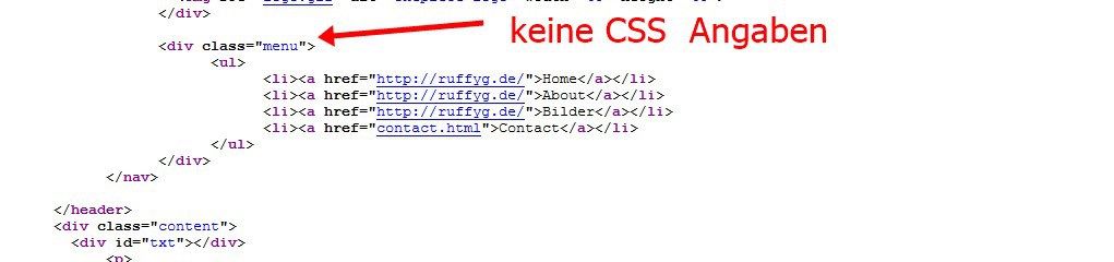
Hier ist noch meine CSS, wäre schön wenn ihr mir mit dem HTML-Code noch dazu schreibt was ich in meine CSS reinschreiben soll.
html, body {
margin: 0;
padding: 0;
width: 100%;
}
body {
font-family: "Helvetica Neue",sans-serif;
font-weight: lighter;
}
header {
width: 100%;
height: 100vh;
background: url(hintergrund.jpg) no-repeat 50% 50%;
background-size: cover;
}
.content {
width: 94%;
margin: 4em auto;
font-size: 20px;
line-height: 30px;
text-align: justify;
}
.logo {
line-height: 60px;
position: fixed;
float: left;
margin: 16px 46px;
color: #fff;
font-weight: bold;
font-size: 20px;
letter-spacing: 2px;
}
nav {
position: fixed;
width: 100%;
line-height: 60px;
}
nav ul {
line-height: 60px;
list-style: none;
background: rgba(0, 0, 0, 0);
overflow: hidden;
color: #fff;
padding: 0;
text-align: right;
margin: 0;
padding-right: 40px;
transition: 1s;
}
nav.black ul {
background: #000;
}
nav ul li {
display: inline-block;
padding: 16px 40px;;
}
nav ul li a {
text-decoration: none;
color: #fff;
font-size: 16px;
}
.menu-icon {
line-height: 60px;
width: 100%;
background: #000;
text-align: right;
box-sizing: border-box;
padding: 15px 24px;
cursor: pointer;
color: #fff;
display: none;
}
@media(max-width: 786px) {
.logo {
position: fixed;
top: 0;
margin-top: 16px;
}
nav ul {
max-height: 0px;
background: #000;
}
nav.black ul {
background: #000;
}
.showing {
max-height: 34em;
}
nav ul li {
box-sizing: border-box;
width: 100%;
padding: 24px;
text-align: center;
}
.menu-icon {
display: block;
}
}
ich baue mir derzeit eine eigene kleine Homepage auf, diese könnt ihr unter ruffyg.de (keine Werbung, sondern nur damit ihr wisst was ich gerne machen möchte) erreichen. Ich bin ein blutiger Anfänger was HTML, CSS, JS, JQuerie und so weiter an geht. Ich wollte nun in der rechten Hälfte meines Sektor-Hintergrundbildes eine digitale, responsive, transparente Uhr einbinden. Am liebsten nur mit HTML und CSS. Ich bekomme es leider aber nicht hin 1. eine passende Uhr zu finden und 2. diese entsprechend zu positionieren. Es wäre cool wenn jemand mir da einen HTML Code schicken könnte.
Hier ist noch meine CSS, wäre schön wenn ihr mir mit dem HTML-Code noch dazu schreibt was ich in meine CSS reinschreiben soll.
html, body {
margin: 0;
padding: 0;
width: 100%;
}
body {
font-family: "Helvetica Neue",sans-serif;
font-weight: lighter;
}
header {
width: 100%;
height: 100vh;
background: url(hintergrund.jpg) no-repeat 50% 50%;
background-size: cover;
}
.content {
width: 94%;
margin: 4em auto;
font-size: 20px;
line-height: 30px;
text-align: justify;
}
.logo {
line-height: 60px;
position: fixed;
float: left;
margin: 16px 46px;
color: #fff;
font-weight: bold;
font-size: 20px;
letter-spacing: 2px;
}
nav {
position: fixed;
width: 100%;
line-height: 60px;
}
nav ul {
line-height: 60px;
list-style: none;
background: rgba(0, 0, 0, 0);
overflow: hidden;
color: #fff;
padding: 0;
text-align: right;
margin: 0;
padding-right: 40px;
transition: 1s;
}
nav.black ul {
background: #000;
}
nav ul li {
display: inline-block;
padding: 16px 40px;;
}
nav ul li a {
text-decoration: none;
color: #fff;
font-size: 16px;
}
.menu-icon {
line-height: 60px;
width: 100%;
background: #000;
text-align: right;
box-sizing: border-box;
padding: 15px 24px;
cursor: pointer;
color: #fff;
display: none;
}
@media(max-width: 786px) {
.logo {
position: fixed;
top: 0;
margin-top: 16px;
}
nav ul {
max-height: 0px;
background: #000;
}
nav.black ul {
background: #000;
}
.showing {
max-height: 34em;
}
nav ul li {
box-sizing: border-box;
width: 100%;
padding: 24px;
text-align: center;
}
.menu-icon {
display: block;
}
}
 und habe mir gedacht das es schön wäre einen kleinen Überraschung jemandem machen .. Sonst sind wir auch immer nett und hilfsbereit
  ... hab das zumindest so verstanden